Go ahead, take another look. I’ll wait.
Yup, I’m still here, and I am as stumped as you are. While I was perusing the Sak’s website I came across this bad boy and all I have to say is…. YES!
Not, “YES, I am going to wear the crap out of this bag and everywhere I go I will yell at people to look at how awesome it is!” but, “YES! FINALLY, a gift for my retired 2nd grade teacher for her carry her cat to the vet in!”
In all seriousness though, I have to ask…. Why?
Why does this giant blue tote have eyelet details all over it? Why does this giant blue tote have eyelet details in THE SHAPE OF A BOW on the front of it, and why doesn’t my great aunt Shirley already own this?
I’m not saying I don’t love a good giant tote. I do. They are practical and useful and necessary in a lot of instances. This one, however, just makes toting painful. The bow on the front of this is completely stupid and unnecessary and I get anxiety when I look at it.
What else is wrong with this picture? This tote is $495.00. I mean come on, its canvas.
If you need a Christmas gift for that special someone in your life that you’re not so fond of, you can pick this bad boy up at Saks.

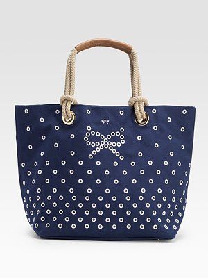
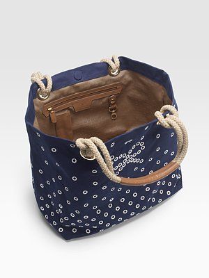






Honey! I have to say “YES THIS UGLY”
I don’t see anything wrong with the bag. It’s obviously for the spring/summer. Would I carry it? Probably not, but only because it’s not my style. I do have a problem with the price as I always do with people charging more than $20-$40 for a canvas bag.
About the bow, it’s a pesky little thing call marketing. Anya Hindmarch puts that bow on all of her handbags. It’s apart of her signature/branding. Like the H for Hermes. The double Cs for Chanel. The Prada triangle. Red soled Christian Louboutin shoes.
I agree with Emma regarding this particular tote. However, Anya makes unique, high quality bags & her fans love that she sort of still flys under the radar. And, if you’re going to review a bag, shouldn’t you be familiar with the brand’s logo?
Totally agree. I’ve never bought one of her bags. The bow struck me as awkward. If it is her signature then I understand. However, I still think this bag is hopeless. Thanks for the info all!
I accept that the bow is there because its the logo but I think what bothers me most about it is that the actual “logo bow” is repeated awkwardly just a few inches above, in its normal size.
The other thing that bothers me is the spacing of the eyelets. The “gradual” tightening of the spacing is very sloppy and then cuts off abruptly. I mean they couldn’t extend the pattern all the way to the bottom?
For the price this bag could be a lot more streamlined- maybe then we would all consider buying it.
When I saw just the outside of the bag, I thought, “Kind of cute and beach looking”. Then I looked at the interior. UGH! Dark brown!! I have an instant aversion to brown and blue together…I had a boss years ago who wore nothing but hideous brown/tan sans-a-belt pants and light to dark blue polyester shirts, and it scarred me for life! *shudder*
I think this is a great bag for high summer and think it was just meant to be a fun beach bag…