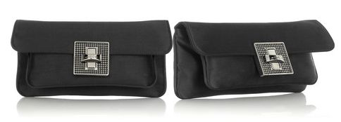
I oooooooooohed when I first saw the Bally Alata Satin Clutch ($695), but then I saw the side view which made me go uh oh. A kangaroo-ish pouch may have been a great idea in the design room but it detracts from the otherwise elegant lines of the clutch. Not that it’s hideous or anything but it lacks sophistication that I expect from a black satin clutch. It feels so pouchy and casual, which just does not go with the formal fabric of the clutch nor the evening gown I’d wear with it. At Net-a-porter.com


the extra pocket looks like a bulging belly
eh, no thanks
It looks Pre-Prada, circa 1989. Trying too hard to be something, a clutch, a statement, a glance. It achieves nothing. Yawn, boredom, like a logo fell off it’s front face. A sad droopy foldover says it all.
To Webmasters at BagSnob:
I love your site, I love your feel, I love your look. Snob TV did slow down the load up times this week, though it’s a work in progress. Yes, I’m on high speed at work, but still the site crashed my beloved Firefox twice.
Do think twice about the floating survey ads. I love the snobs (bloggers & commenters) too much to leave, but your new ad mode almost made me click on the much feared “X” button. I do review all ads on the side, but detest the floaters, as they draw attention to colleagues and bosses walking on by. After all, even when surfing on Bagsnob.com, I qualify it as research for my job.
Warmly,
A Cyber Chick
jhas potential with jeans
oh yikes!!!!!!!! (the front really does look nice though)
a full tick