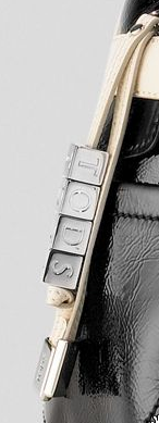
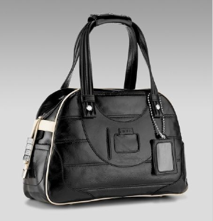
This new bag for Fall is a part of a special bag collection that is designed by Derek Lam for Tod’s. Of course the entire Tod’s collection, not only bags, is overseen by Derek Lam but there are a few select bags that has his special personal touch and you can tell which ones these are by the keychain letter blocks that spell out “Tod’s”. I understand  that this is meant to be cute and kitschy but I don’t like it. When I go and spend a couple grand on a bag, I don’t want something on there that is meant to be a gag. I’m going to go ahead and say this because I know some of you are already thinking it, this is a total Asian thing. Every Asian person has some sort of dangling strap on their cell phones with their name on it (OK, I am guilty). It’s fine and good for a cell phone but keep that away from my bags, please!! The bag itself is actually really cute and I like the departure from the classic old school Tod’s. It has all the great detailings you’d expect from Tod’s including convenient pockets and interior organization. The bowling style bags are back and the use of quilting and the distressed crinkly leather mixes a little bit of the old with the new. This is obviously meant for the younger crowd and is not a classic Tod’s but this is one of those bags you can take out in 10 years and it will be cool and retro chic without looking at all dated (yes, in fact, I can predict the future). At Neiman Marcus for $1550.
Tod’s Quilted Bowling Bag
By Kelly Cook


This bag is so boring. Not worth the money.
I agree with Catherine. It’s boring. There is nothing distinctive about it : (
I like Derek Lam’s own bags, especially the hildegard. this one is blah
It looks like a gym bag and I used those letter cube tag things when I was 14. That’s 9 yrs ago.
this bag reminds me of an upgraded Puma gym bag. so unlike tods and totally blah…